

CWP Blog | CWP
Discussions with Deb: A Wonky Look at EEOICPA
March 1, 2019
March 1, 2019
CWP
CWP Blog
Warning! This is a wonky blog. If that’s not your cup of tea, I totally understand and you have my permission to skip it. I just happen to like data and facts. I find it interesting how you can use facts to paint a picture using graphs and charts that reveal information that isn’t obvious when you just look at the numbers.
The Energy Employees Occupational Illness Compensation Program (EEOICPA) has been around a long time now-eighteen years. That’s long enough for a lot of things to have changed. One of the things I’ve always thought makes sense is to keep track of how the claims are being paid.
I’ve done this in several different ways over the years.
- I update the EECAP maps four times a year. The maps are based on the statistics DEEOIC publishes on the Department of Labor (DOL) Statistics Webpage and these report different facts on the facilities, states, and EEOICPA district offices covered by the program. I also put links to the Google Fusion Tables used to power the maps at the top of the Maps page because I believe strongly in sharing information.
- Periodically I have taken a look at various other places DOL reports EEOICPA statistics and tried to put together a historic overview of how things are going. This gets complicated because DEEOIC does not report all the figures in the same place and I end up bouncing from one document to another while trying to keep all the facts straight.
I thought it was time to take another look and see how things are progressing with payments and claim numbers so last week I began to try to put together a picture. Hopefully, some of you will find this interesting.
In this blog I’m just addressing the combined figures for EEOICPA claims. I will do Part B and Part E separately at a later date. There are two ways that DEEOIC measures EEOICPA facts. One is by cases and one is by claims. Cases encompasses all workers who have filed a claim. Claims incorporates each worker AND each survivor who have filed a claim. I chose to track the data by using claims because I feel strongly that everyone who has lost a loved one should be counted along with each worker who has been harmed.
Let’s see what the data has to tell us. I have added links to each graph for people who want a larger view. Just click on the graph to be taken to a larger view.
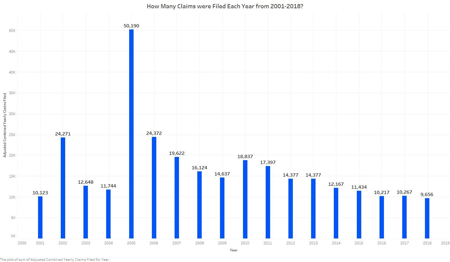
I began by looking at how many claims have been filed over the years. You will note a large spike in the data in 2005. This is because 2005 is when Part E claims began coming into the system.
Next I thought it would be useful to take a look at the number of claims that had been paid over the span of the program. One known problem with doing this is that in 2013 DEEOIC changed the system they used to track claims and accidentally doubled some of the payments. I’ve adjusted for this the best I could but you should be aware that the figures for 2012 and 2013 are an estimate and not exact.
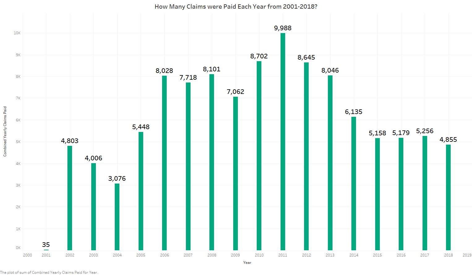
Looking at these two graphs together tells us that the claims filed and the claims paid do not always track at the same rate. In some instances there were more payments in years with lower claims filed and vice versa. I thought this was interesting so I decided to take a look at the percentage of claims paid for each year:
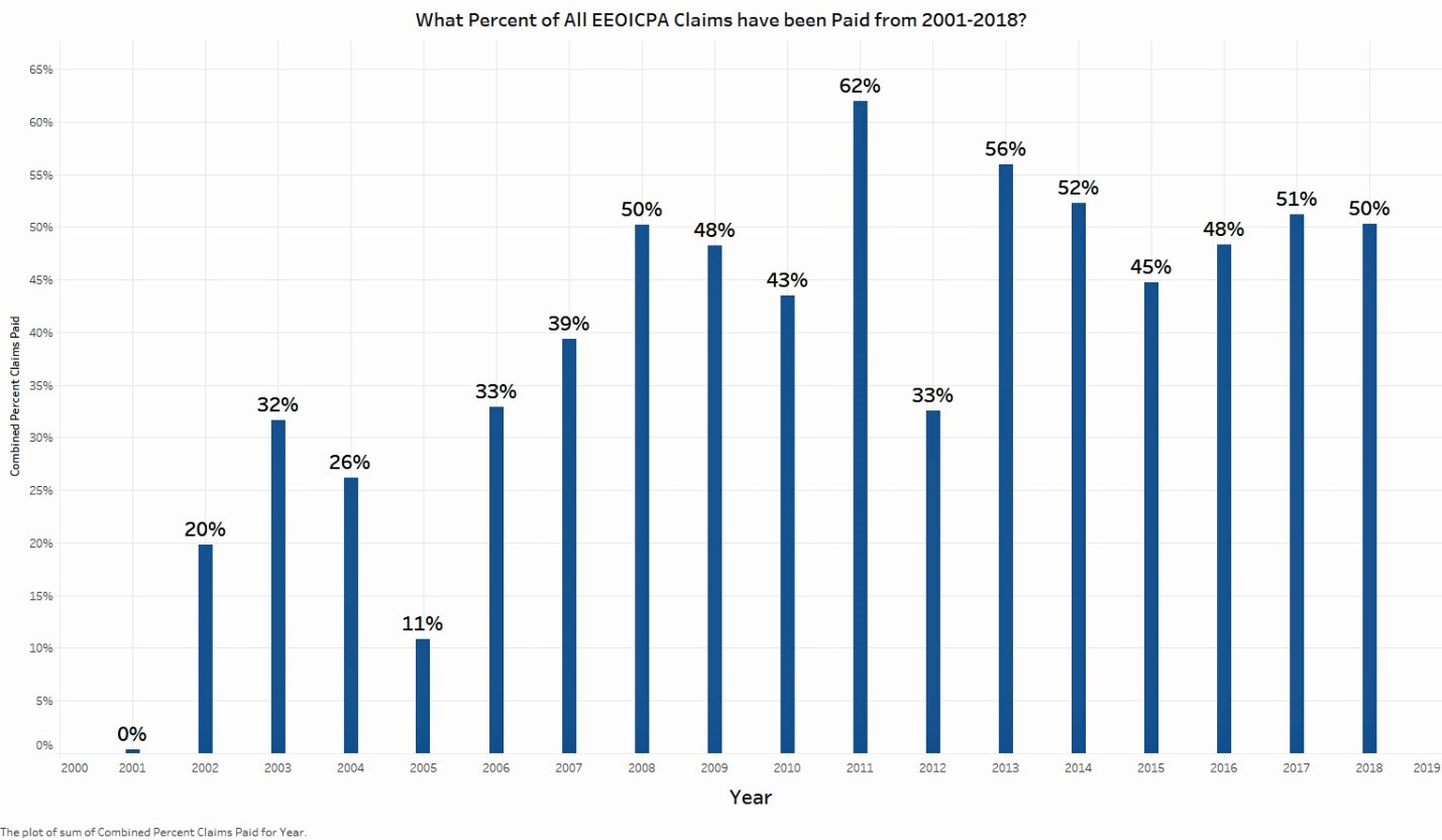
So all in all the percent of claims being paid is higher now than when the program first began. This makes sense in terms of DEEOIC learning how to manage the claims but makes me wonder if some of the earlier claims have been reevaluated. It seems likely that some valid claims were not paid in the early years.
Next I thought it would be interesting to see how the amount of compensation paid out tracks:
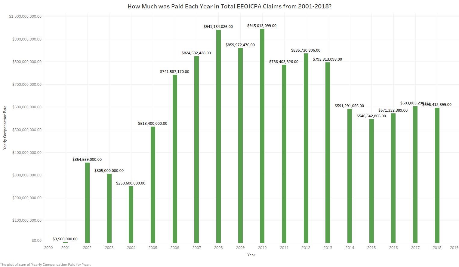
It looks like this tracks along fairly closely to the number of claims paid. That’s good.
Then I started wondering about payment of medical bills for workers who have the white card:
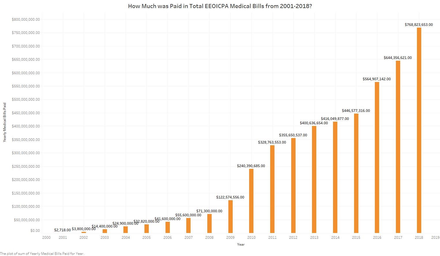
Wow. Now that is interesting! The amount being paid medical bills has increased dramatically. This is actually a good sign, I think. This means that workers are living longer because they are getting proper medical care. By living longer they generate more medical bills.
This made me want to compare how much is being spent on compensation compared to how much is being spent on medical bills.
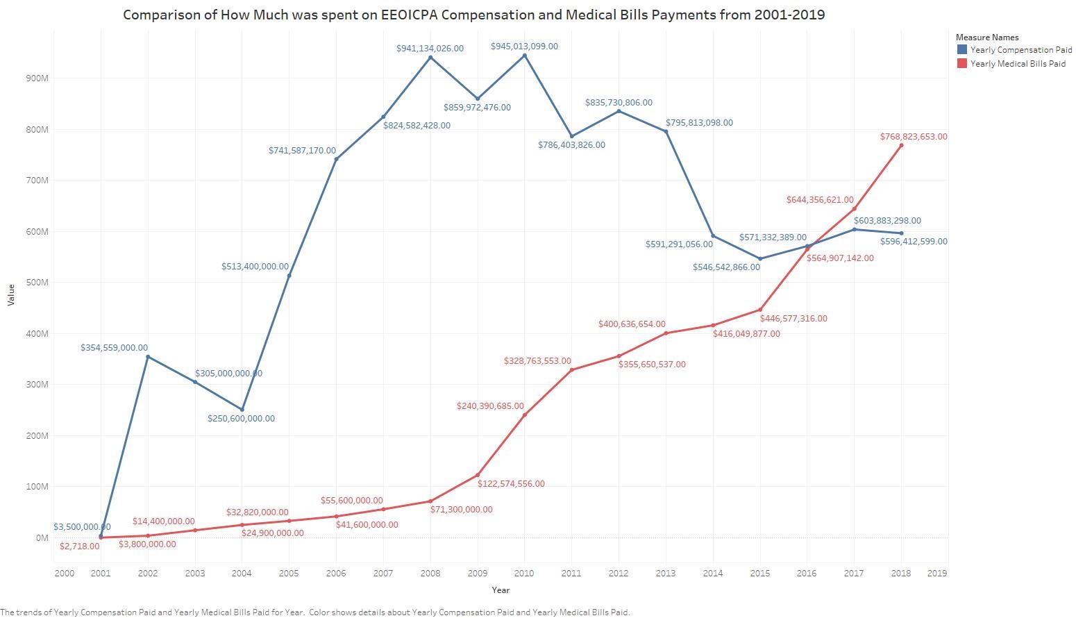
Another interesting revelation. In 2016 the program began paying more in medical bills than it was paying in compensation.
So there you have it. The first overview of EEOICPA claims payments from the beginning of the program through the end of last year.
I’m working on doing the same type of analysis for Part B and Part E claims. Stay tuned!
Data used from: